Que SeRaw SeRaw
Showing Brand Identity & Simplifying Online Ordering
Background:
Que SeRaw SeRaw is a raw food grab-and-go shop in Burlingame, CA known for delicious food and a welcoming experience. The store was attempting to move from a brick and mortar storefront to an entirely online experience.
The Goal:
The goal of this project was to recreate the physical atmosphere online so that new and old customers alike could easily understand the brand's values and simply order their meal.
The Timeline
Two Weeks
My Role
UX Researcher, Strategist & UI Designer
Tools Used
InVision, Marvel, Miro, Sketch, Whimsical, Zoom
The Process Path
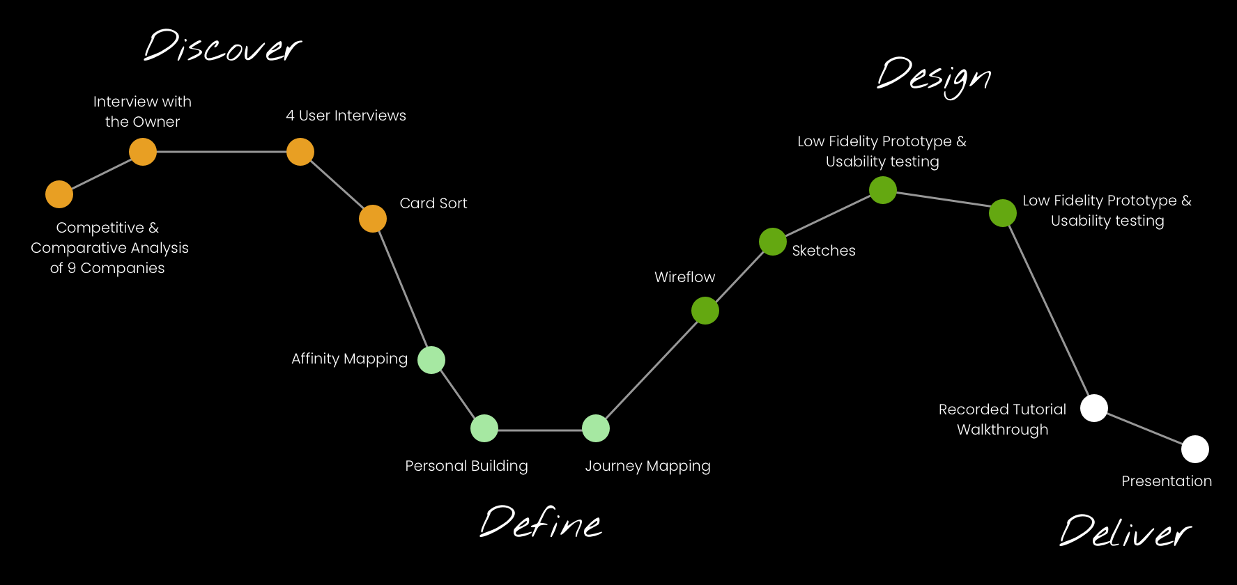
Research Insights
1.
2.
3.
A Comparative Analysis showed me that Que SeRaw SeRaw is the only raw vegan shop in the area, giving it a unique selling proposition for those looking to follow a raw diet
The Owner shed insight on how customers need to try a sample for themselves to feel comfortable with raw food. User interviews further backed up this finding as they found that this type of eating is intimidating for newcomers.
Both new and returning customers said that "There is no such thing as too much information" in User Interviews as the only way that they can learn about what they are eating, so information shows care.
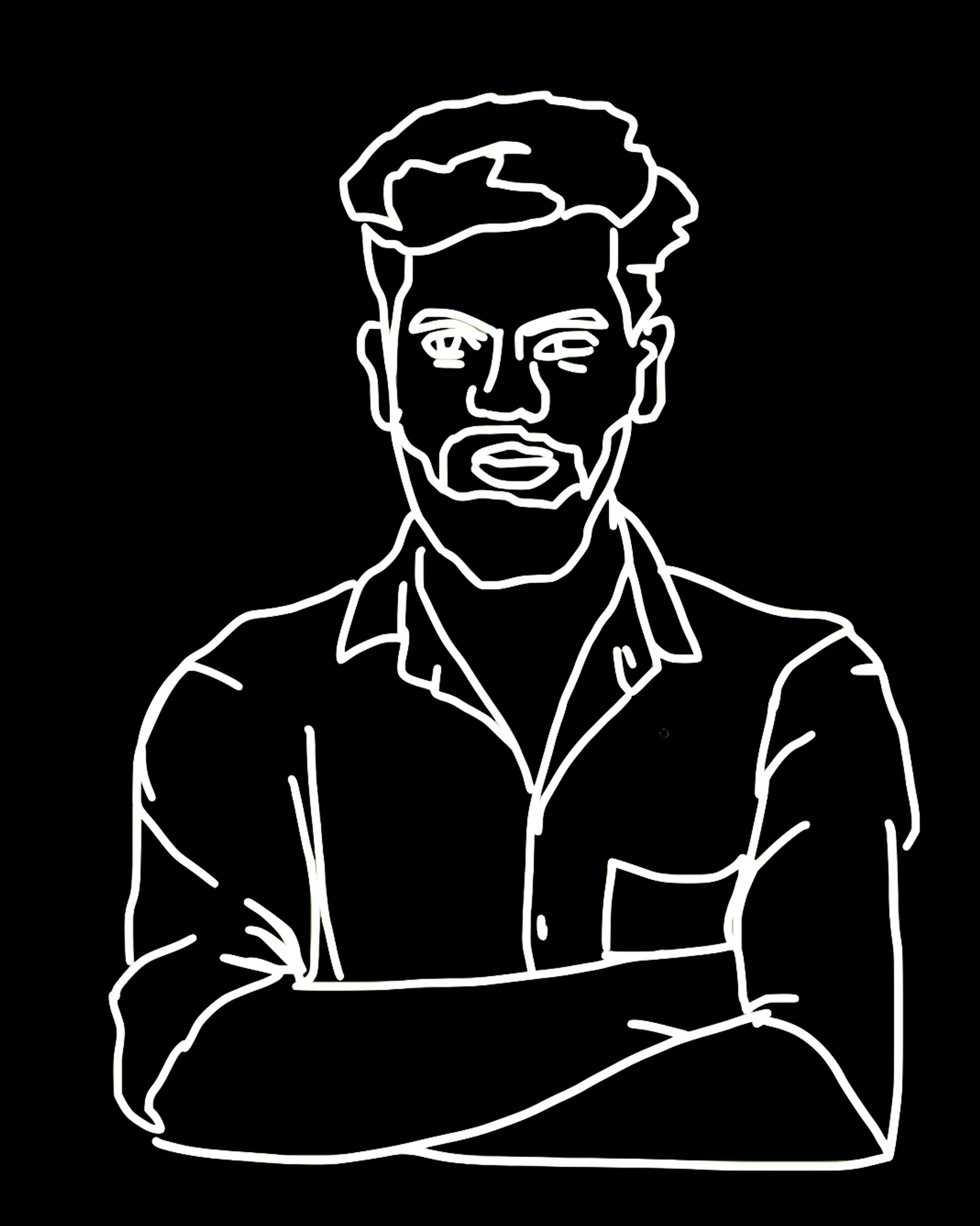
Meet Alex,
The curious newbie to raw eating
Created based on data with the intention of making user insights more actionable. There were two distinct types of eaters interviewed, the curious newbie to sustainable eating & the more seasoned raw eater, Que SeRaw SeRaw's unique selling proposition, found in the competitive analysis, increased the likelihood that customers looking for raw food will stick with the shop, making Alex, who isn't yet committed to this kind of eating, the more beneficial audience to design for.
Alex is all about exploring new places and likes to eat tasty food. He doesn't know much about sustainable eating but cares about the health of the planet and has tried some sustainable trends, like Beyond Burgers, and enjoyed the taste.
Goals
• To find food that Alex is going to enjoy eating
• Learn more about the impact of his diet
Needs
• Encouragement to educate himself on eating raw
• Confidence in talking about dietary preferences
Roadblocks
• Intimidated by foods he doesn't know anything about
• Only learns about the impact of his eating through popular media
The Problem
Alex needs to gain confidence and knowledge about sustainable eating because the intimidation he feels about raw eating prevents him from meeting his goal of eating healthy and tasty meals.
The Solution
Updating the Que SeRaw SeRaw website to more clearly display for both knowledgeable and new customers what's on the menu and what benefits eating raw provides will encourage making the jump from placing in-person to online orders.
The Design
During my chat with the Owner, we discussed how her needs for the website were not being met as here developer wasn't able to put the weekly menu on the front page & she doing facilitating the checkout process through a different website that you couldn't get to through the navigation bar. This all made it hard for users to engage with the website and was possible to fix as Que SeRaw SeRaw is made on a site that allows for both of those things. I proposed making those changes in addition to building out the About & Resources pages to meet user needs when it came to understanding the industry and how Que SeRaw SeRaw fits in.
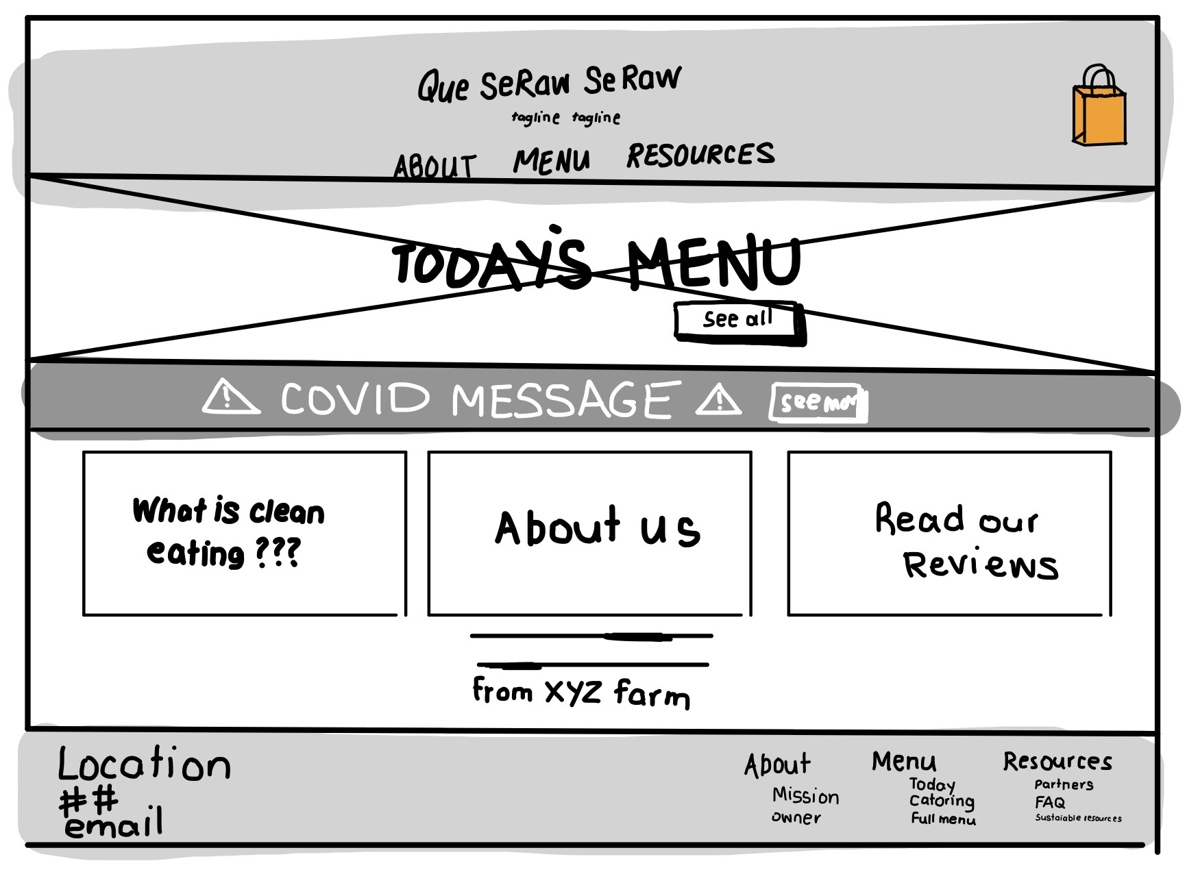
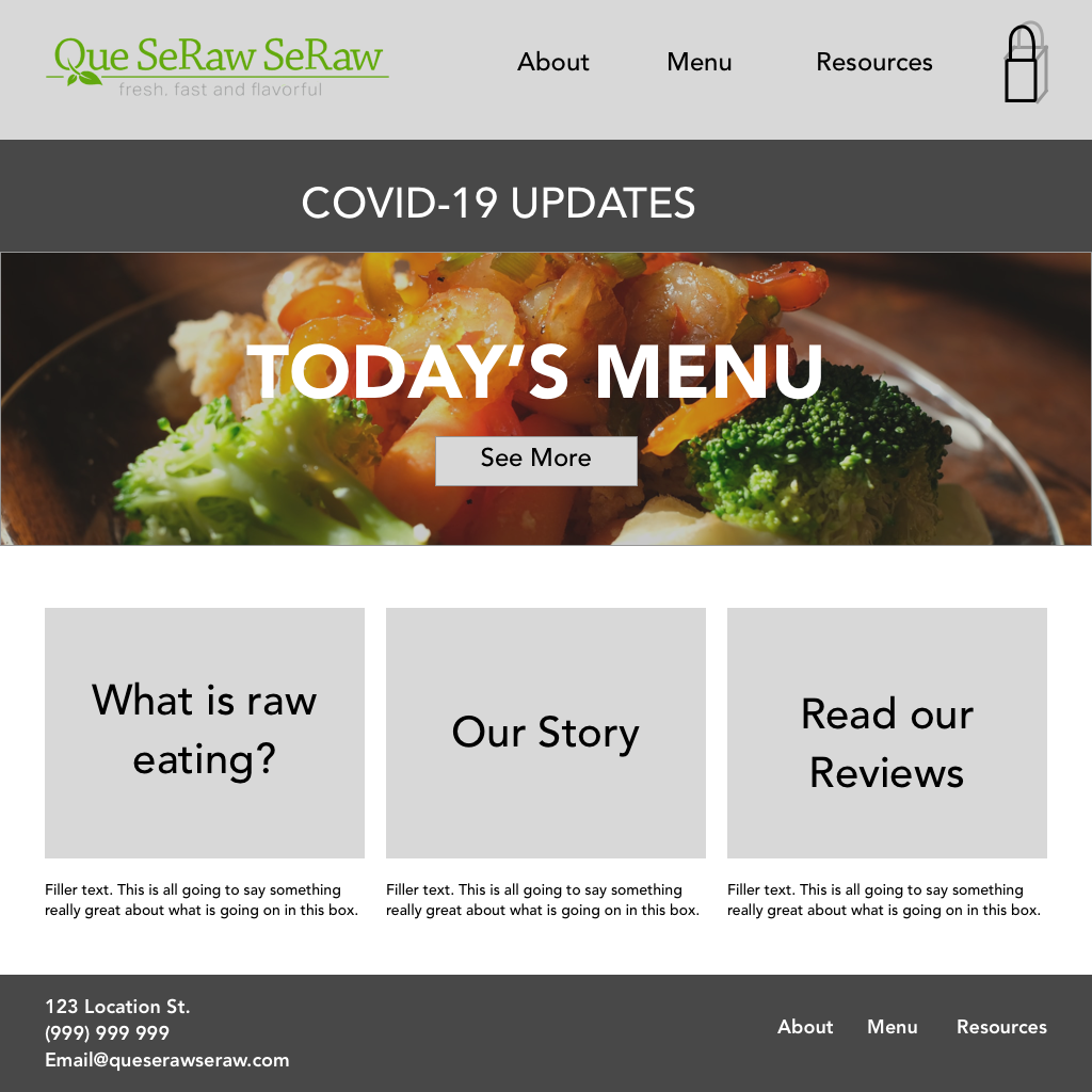
The Home Screen
From the original sketch onward, much of the home screen stayed constant, although improvements were made to separating the logo from the menu, fleshing out the footer, adjusting the COVID-19 update to make sure it wouldn't be blocked by drop-down menus, and adding colors and images to represent the brand.
Sketches
Digital Draft
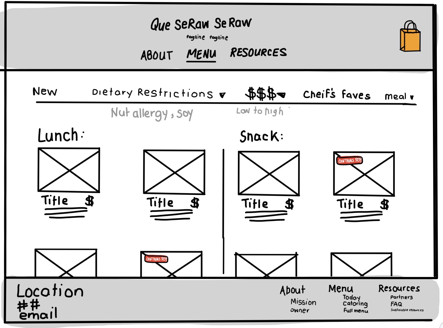
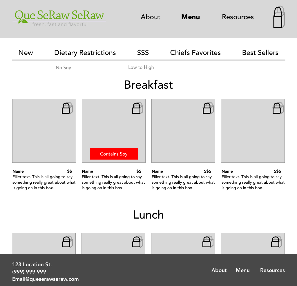
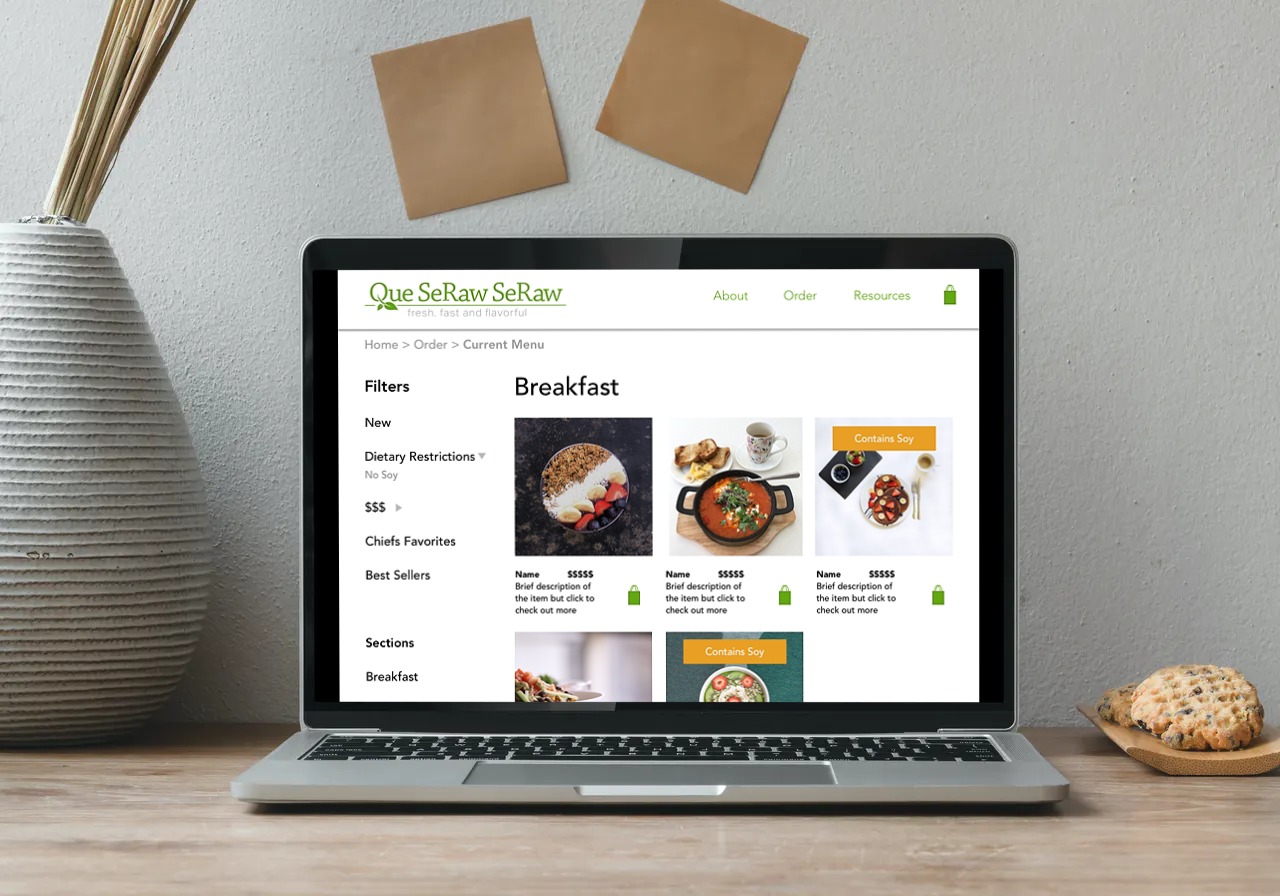
The Menu
Changes to the Menu page were more substantial, as user testing revealed that users were unable to find the filtering bar, something that our competitive analysis and user interviews deemed to be important. Therefore, the filter bar was moved from on top of the menu to the left of the page where it can be accessed no matter how far you scroll down, which helps users jump from section to section.
Sketches
Digital Draft
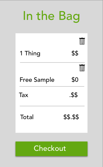
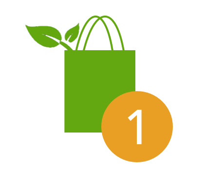
Special Touches
Since the goal of the project was to showcase Que SeRaw SeRaw's unique and caring personality, personalized touches were important. I suggested that:
- a free sample be added during the checkout process to familiarize customers with new raw foods
- the leaf logo for the brand be added to the bag after an item has been placed into it
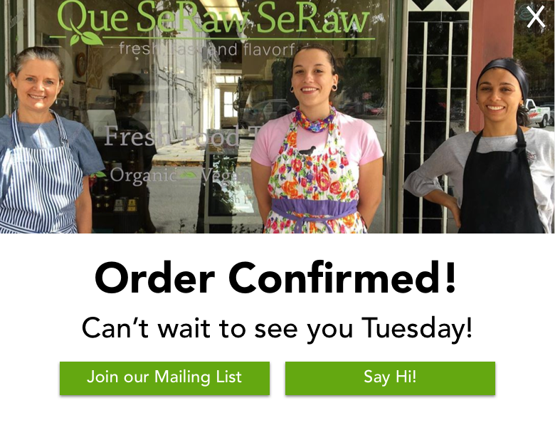
- A picture of the shop's staff be included to create a connection between employees and customers.
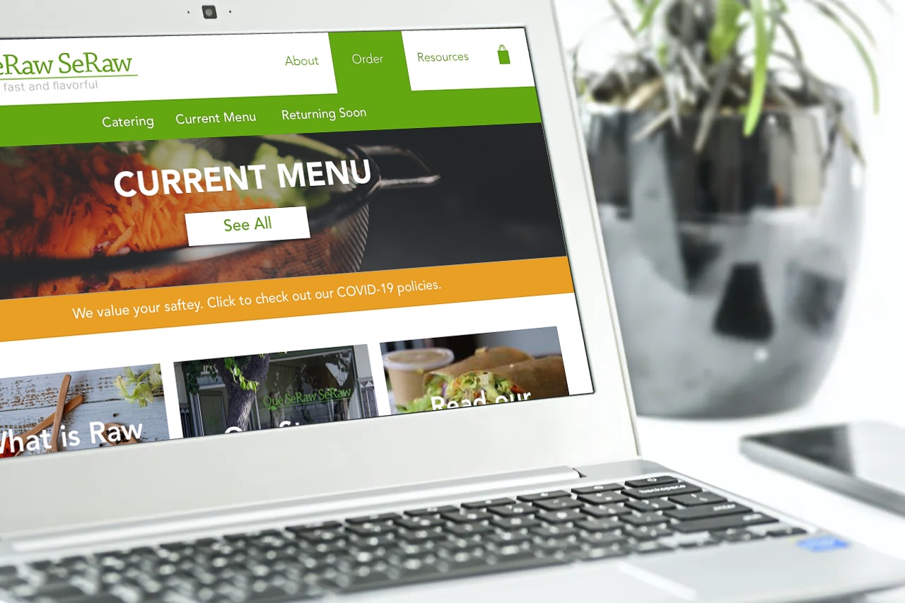
Watch Que SeRaw SeRaw in Action
Reflection
Lessons Learned
UX copy and headings need constant attention. For every round of iteration, I came up with a new way to say "There is one menu with food available now and one that shows the entire catalog." Although each round, this text got more concise, from "Daily Menu and Past Favorites" to "Current menu and Returning Soon," each heading created new problems for users to be addressed with more copy in the next update. Finding the words that resonated with most users was really exciting and reminds me that copy needs to be a priority.
Next Steps
- Change the COVID message to explain the ordering process rather than focusing on how COVID influenced why those changes were made
- Include more personalized details, like the leaf in the bag or the sample, before the checkout process
- Investigate if users would be interested in a profile function to track what they eat or get rewards